Brand book
This brand book brings together the visual and verbal building blocks that make Maritime CleanTech recognisable across platforms, formats and senders.
It is a practical working tool, not a strict rulebook. Use it when creating presentations, reports, social media content or partner material to ensure that Maritime CleanTech appears clear, consistent and unified.
If you are unsure about how to use an element, or need a file or format that is not included here, please contact Daniel Rodriguez Turøy at daniel@maritimecleantech.no


1. Logo
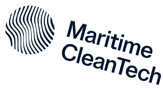
The Maritime CleanTech logo should always be used in its complete form, consisting of both the symbol and wordmark. To maintain consistency and recognition, these elements must never be separated or rearranged.
The logo should be used in either Deep Blue or white, depending on the background and contrast requirements.
The only exception applies to social media profiles and square format applications, where the symbol may be used on its own.
Please refer to section 1.2 before using the logo to ensure correct application and avoid misuse.

Main logo

Alternative logo
1.1 Logo with tagline
The logo is also available in a version featuring the tagline "Norwegian Centre of Innovation and Expertise".
The same principles apply to this version as to the primary logo. The symbol and wordmark must always remain together and should never be separated, rearranged or modified.

Main logo

Alternative logo
1.2 Incorrect logo usage
The logo must always be reproduced in its original form. Its proportions, colours, and the relationship between the symbol and logotype have been carefully balanced and must not be altered, reconstructed, or decorated. The examples below show logo usage that is not permitted.

Do not alter the logo colours

Do not use the logotype on its own

Do not scale the elements independently
Do not rotate the logo

Do not stretch or distort the logo

Do not add shadows or effects
2. Typography
Inter has been chosen for its strong readability across digital surfaces. For an organisation that guides stakeholders and communicates complex knowledge, this makes it a practical and reliable typeface.
The typeface is neutral and modern, allowing the message to take centre stage without visual noise.
Use the weight Semi Bold for headings to create clear hierarchy. Use Regular for body text, captions, descriptions and supporting information.
Headings
Inter Semibold
Body
Inter Regular officia laboris ipsum deserunt cupidatat. Nostrud commodo sunt ex reprehenderit dolore reprehenderit dolore quis non ex tempor. Ipsum sit mollit aute tempor ullamco do aliqua ullamco. Sint ut occaecat ut excepteur reprehenderit voluptate non commodo sit irure mollit sit est incididunt pariatur. Aliqua cupidatat aliqua eiusmod enim id commodo esse officia quis minim nostrud aliqua sunt sit. Sint laboris cillum sunt tempor non exercitation nulla esse. Minim elit est laboris ipsum.
3. Clear space
The logo needs sufficient space to remain clear and recognisable.
The minimum clear space is defined by the height of the “M” in the wordmark. This distance should be maintained on all sides of the logo, both towards other elements and the edge of the format.
The clear space scales with the logo and must always be preserved, regardless of size or application.
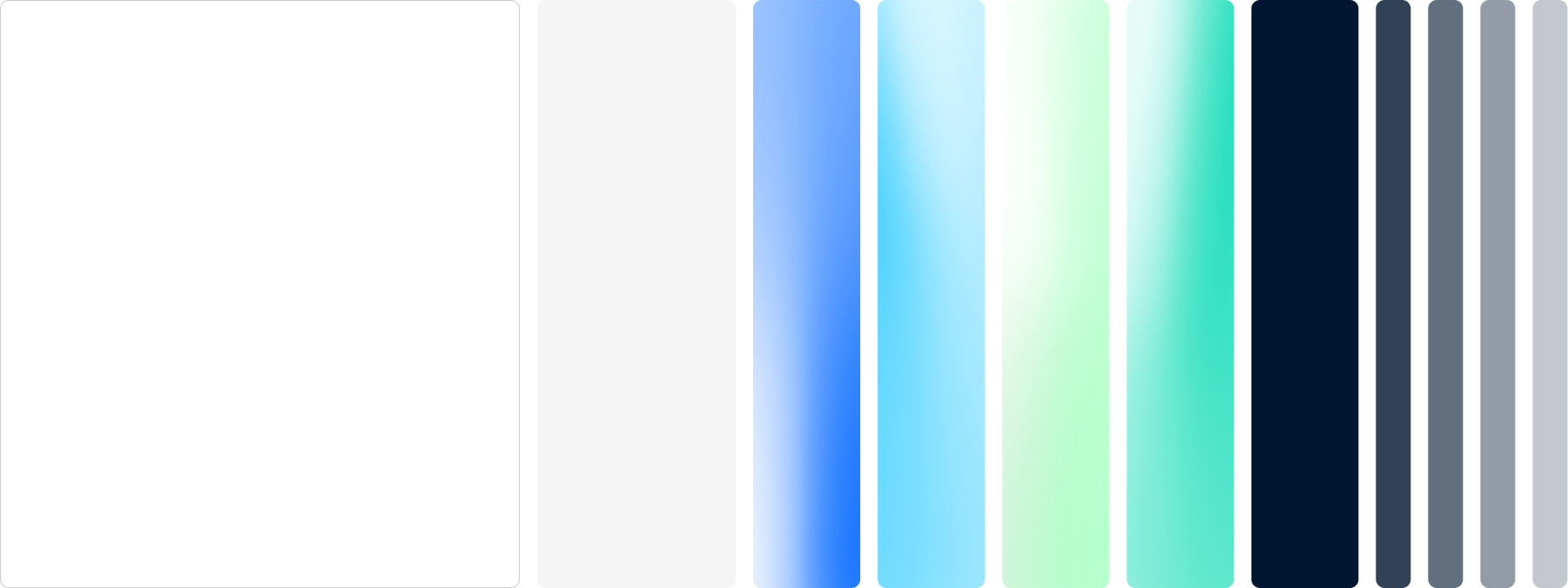
4. Colors
The colour palette reflects the depth, energy and momentum of the maritime ecosystem. Dark blue tones create a stable and professional foundation, while lighter tones add clarity, technology and movement. Green tones are used as accents to create a fresh and modern expression.
Colour should always be used with accessibility in mind. Ensure sufficient contrast between text and background, and avoid using colour as the only way to communicate meaning. Strong contrast, clear hierarchy and readable combinations should guide all colour use across digital and printed applications.
Used consistently, the palette creates a cohesive, recognisable and professional visual identity across all touchpoints.
4.1 Colors grading (light)
The colour palette reflects the depth, energy and momentum of the maritime ecosystem. Deep, stable blues create a credible foundation, while lighter tones add clarity, technology and forward movement. Fresh green accents should be used selectively to highlight key information, actions and moments of innovation.
Always use colour with accessibility in mind. Ensure sufficient contrast between text and background, avoid placing text on low contrast colour combinations, and never rely on colour alone to communicate meaning.
Together, the palette creates a consistent, recognisable and professional visual identity across every touchpoint.

4.2 Colors grading (dark)

5. Graphic element
The visual identity has two primary graphic elements: the gradient and the frosting overlay.
The gradient is used to add depth, light and movement to backgrounds and selected layouts.
The frosting overlay is used on images and backgrounds to create better contrast, improve readability and make the expression more consistent across different formats.
Both elements should be used consistently and with a clear purpose.
Brand
5.1 Pattern waves
The gradients are designed to create a brighter and more optimistic expression that reflects the momentum of maritime innovation. Inspired by the movement of waves and the flow of the ocean, the transitions bring energy and direction while improving clarity and readability across applications.
Use the wave gradient as a background element in selected layouts, such as section headers, presentation slides and campaign surfaces.
It should add movement and depth without competing with the content. Avoid using it behind long text sections or where it reduces readability.


5.2 Pattern over images
The wave overlay softens image contrasts and creates a more consistent visual base. It provides greater control when imagery varies in style, light and composition, ensuring a clean and cohesive expression across applications.
This makes it easier to use a broader range of images while keeping the overall identity structured, calm and clear.
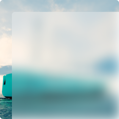

5.3 Pattern opacity
The wave overlay is applied at two opacity levels depending on the background.
On coloured backgrounds and gradients, 65% opacity is used to create smooth transitions between colours and strengthen the sense of movement within the visual system.
On photography, 40% opacity is used to preserve the image while providing sufficient contrast for text and other content.
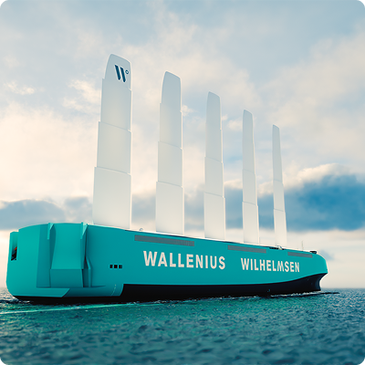
5.4 Pattern together with partners
When showcasing partners, their own brand colour is used as the primary foundation. This helps strengthen the partner's identity while allowing them to remain clearly recognisable.
The Maritime CleanTech wave overlay is then applied to connect the expression back to the main visual identity. The result is a balanced system where partners are given space to stand out, while still feeling part of a unified Maritime CleanTech ecosystem.

6. Icons
Icons should be used to support navigation, categorisation and quick recognition of key areas.
Use icons together with text, not as standalone communication. Keep size, colour and spacing consistent across applications.
Icons should simplify the message and should not be used as decoration.


7. Examples
Below are some examples of the brand in use on different surfaces and in different contexts.
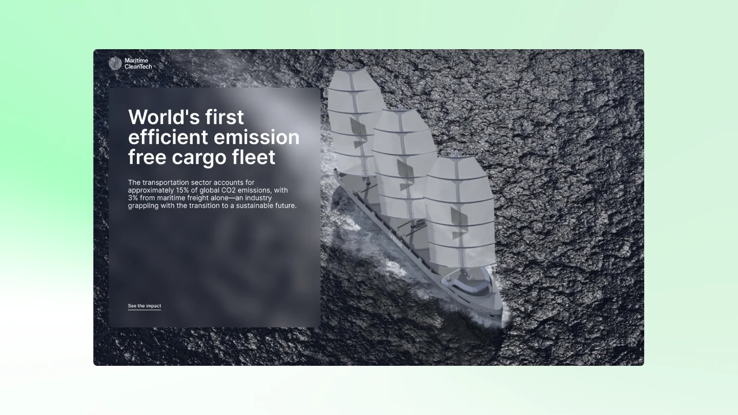
Website
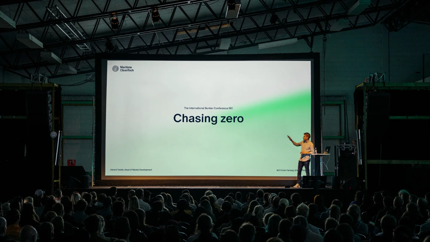
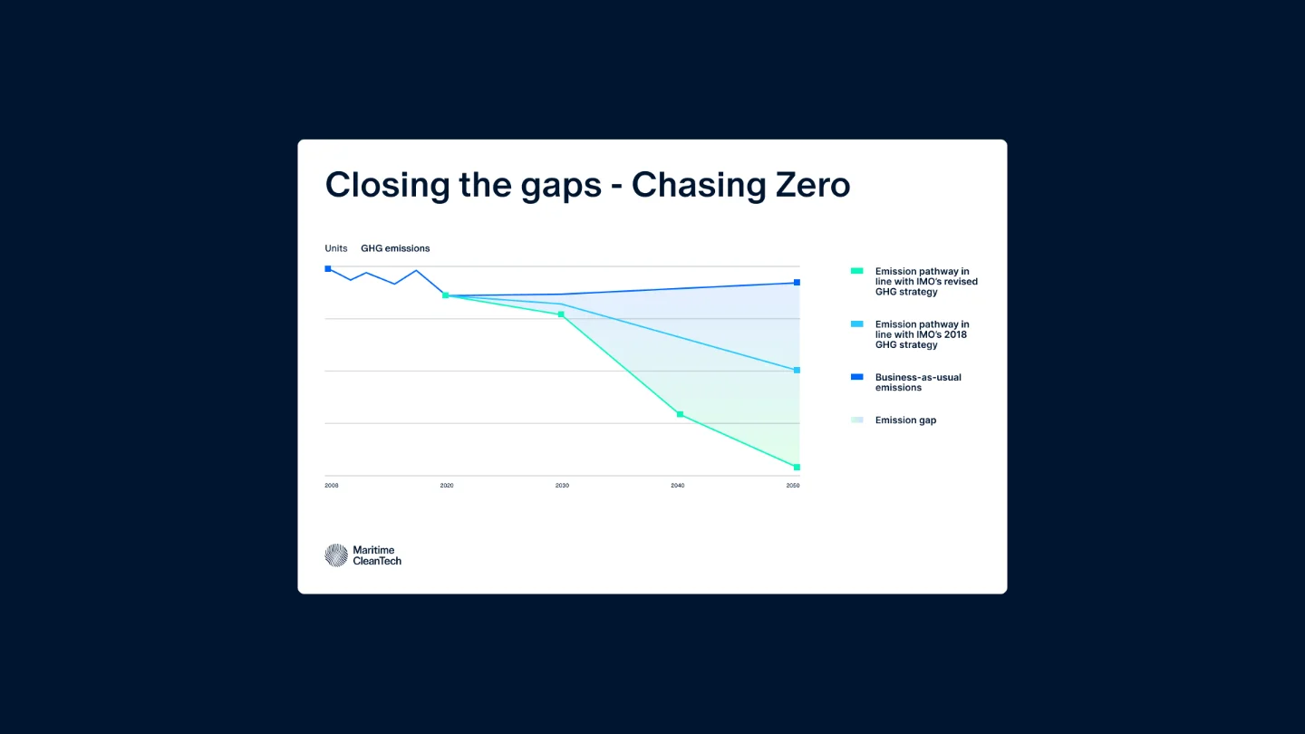
PowerPoint slide at an event
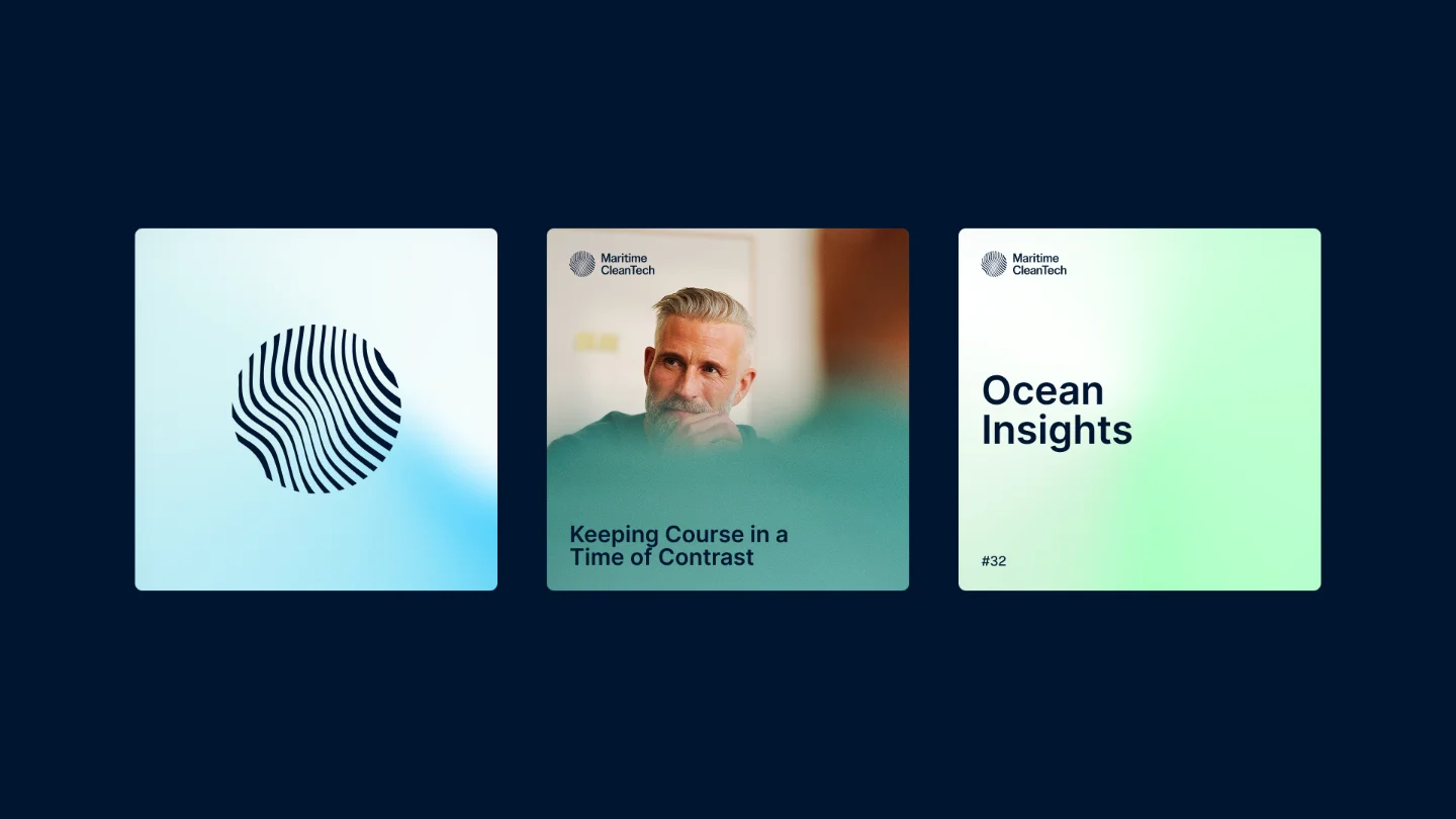
Cards
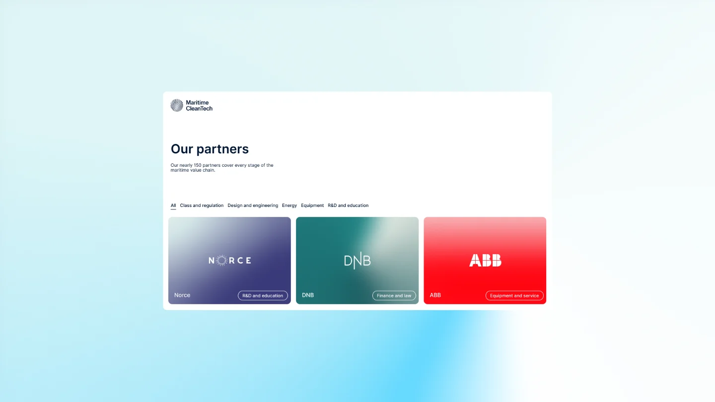
Partners